(01)Selected work / SkincareConcept
Serein
A skincare identity built for a growing range.
- Sector
- Skincare
- Service
- Branding
- Format
- Concept
(01)The idea
One identity, several formats.
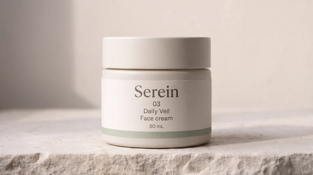
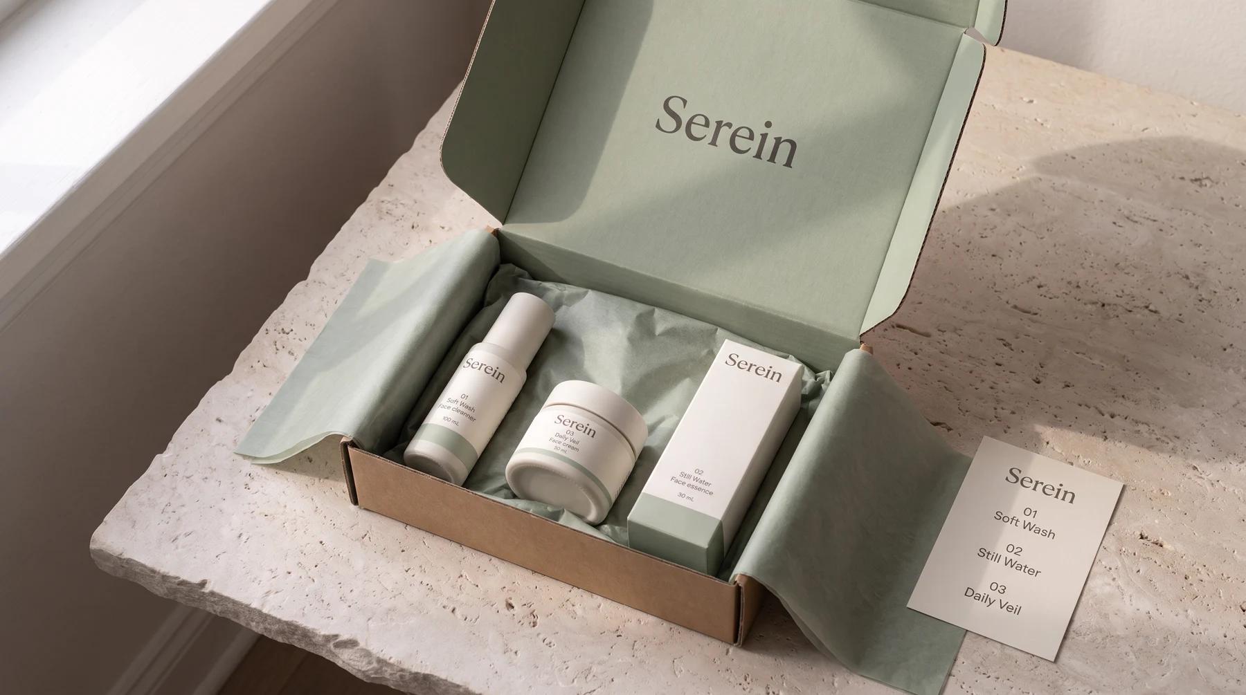
A carton, a jar and a bottle give you three very different surfaces to work with. For Serein, we kept the wordmark, colour and spacing consistent across all three. The idea was to give the range a recognisable face and leave room on each pack for the information a shopper needs.
(02)Details
From material to range.
(03)Application
Room to grow.
The same layout rules could carry across new pack sizes, product listings and a launch shoot. The full-range image shows how the pieces can read as one family. Individual frames give each format space on a product page.
Have something in mind?
Building a product range?
Tell us what you’re launching and which formats the identity needs to cover.
Tell us about it studio@tipo.media